
Designing reports and dashboards in Power BI is exciting because things are constantly being upgraded to make your life easier and more interesting. The Power BI team releases updates for Power BI Desktop on a monthly cadence. In the second part of our 2020 in Review series, we will review some of our favorite updates for Power BI users that are responsible for creating reports and dashboards.

Power BI Designers Updates
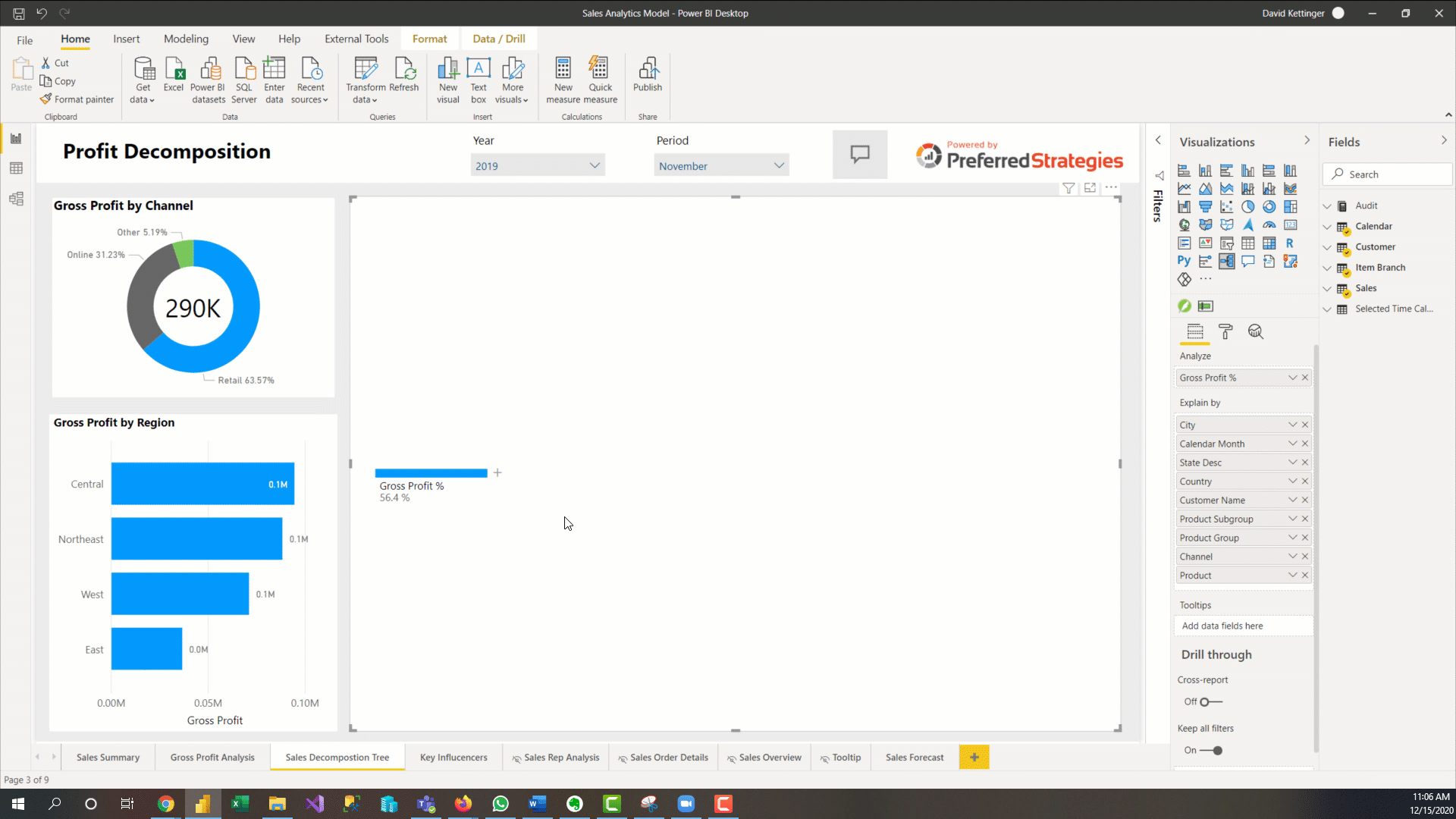
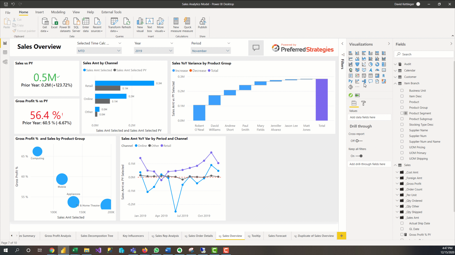
Decomposition Tree
This visual was generally released back in May and allows users to analyze a measure across multiple dimensions. While you can’t use the AI features of this visual in Live Connection mode to a SSAS Tabular model yet, it is still a valuable tool for ad hoc exploration and conducting root cause analysis.
Hierarchal Slicer
This is a long-awaited update that allows you to configure a hierarchy of fields to filter your report with. Before, if we wanted to set up a slicer on two related fields such as Product Group and Product Subgroup, we had to create two separate slicers which took up a lot of canvas real estate and required more clicks from users. Now we can use one slicer with a hierarchy to accomplish this.
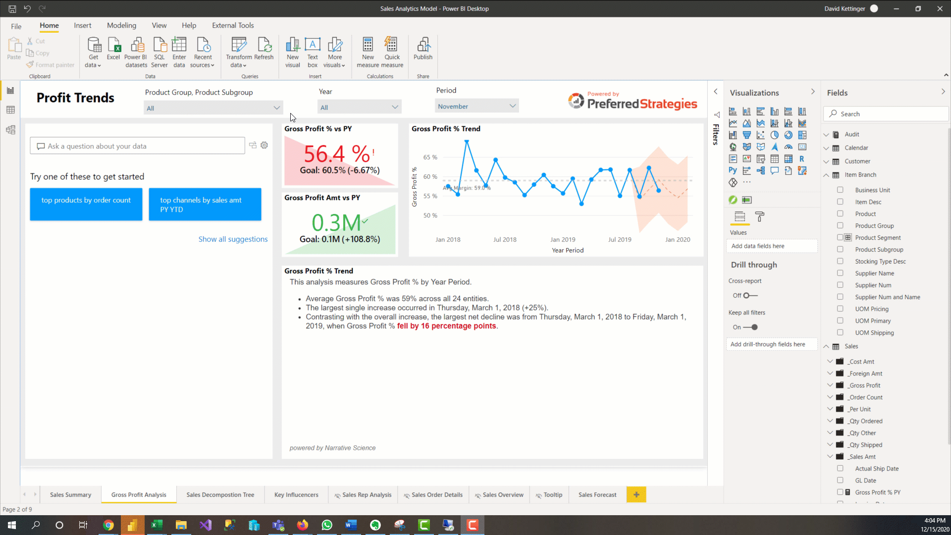
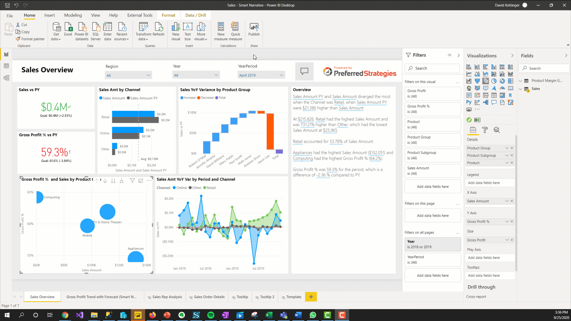
Smart Narratives (Preview)
Natural Language Generation technology makes its way to the standard Power BI visualization family with this new AI visual. This feature allows PBI designers to add dynamic, customizable narratives to their reports to address key take ways, point out trends, and explain the data on the canvas. Unfortunately, as of this writing, it only works with imported PBI data models and not live connections to SSAS or PBI Datasets.
Search for Workspace During Publish
Previously, as the number of workspaces grew at your organization, so did the time you had to spend scrolling when trying to publish a report. However now you can use the new search box in the publish menu to quickly find the workspace you would like to publish to and save yourself from carpel tunnel.
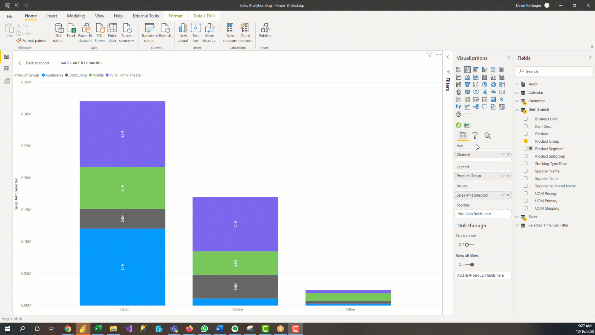
Totals for Stacked Visuals
If you are using the stacked bar and column charts in Power BI then you likely have had to find a work around to showing totals for the entire bar. Usually this meant doing some fancy visual overlay so that you really had two visuals working to accomplish this. Fortunately, with the latest release of Power BI Desktop this is now just a format setting under the Total Labels section.
Small Multiples (Preview)
Also known as Trellising or Lattice charts in the data viz world, this long-awaited feature allows you to present the same visualization, split by different slices of a data set, in an easy to interpret side-by-side format. For example, if you want to examine how your different Product Groups are performing, you can show the same Sales by Channel bar chart visual in four different charts broken out by each of the values within the Product Group dimension as seen in the image below. Since this is a complex Preview feature, there are many limitations and bugs that still need to be worked out.
Auto Report Generation (Preview)
You may have recently noticed a new button on the content navigation pane in the Power BI Service that says “Create”. This is a new way that users can quickly create reports by copy/pasting data from a spreadsheet. While we still recommend at this time that PBI Designers create Power BI reports for production using PBI Desktop, this new feature could be very handy for prototyping new reports and getting ideas for analysis. This is a great example of how automated machine learning is being integrated into Power BI and we’re excited to see improvements to this feature to help all user quickly create compelling insights.
Stay tuned for Part 3 of the 2020 in Review series where we will take a look at some of the most important updates for users that administer Power BI and manage content.