For both business users consuming insights through the Power BI Service and developers designing reports in the Power BI Desktop, the continuous innovation going on at Microsoft these days within the Power BI and Azure Analytics product groups means there’s a lot of updates to keep track of.
In this on-going series we will comb thru all of the latest updates and provide you with an overview of the most important features that are relevant to common enterprise analytics scenarios and deployments. We do this in the form of a live presentation with demos as well as a blog with mini recorded demos. Click here to watch the corresponding live education session recording.

Power BI Consumers
Power BI Goes Green
Late last year, Power BI announced that it would switch its application accent coloring from yellow to teal in order to make it more accessible for users with disabilities. This color coincidentally (or not) also matches the color scheme for the new Fabric platform announced last month that will include Power BI. More on that to come soon but if you have started to see the green Fabric logo in the Power BI Service…this is why.
Subscribe to Personalized Views of Reports with Filters Applied
With the latest updates to the Subscribe feature, you can modify reports to be more relevant to yourself and then subscribe to that view. To do this, choose the Include my changes option in the Subscribe to emails window. This personalized view will include any of the following changes: filters, slicers, personalize visuals, cross-filtering or cross-highlighting, drill down or drill up, and spotlight.
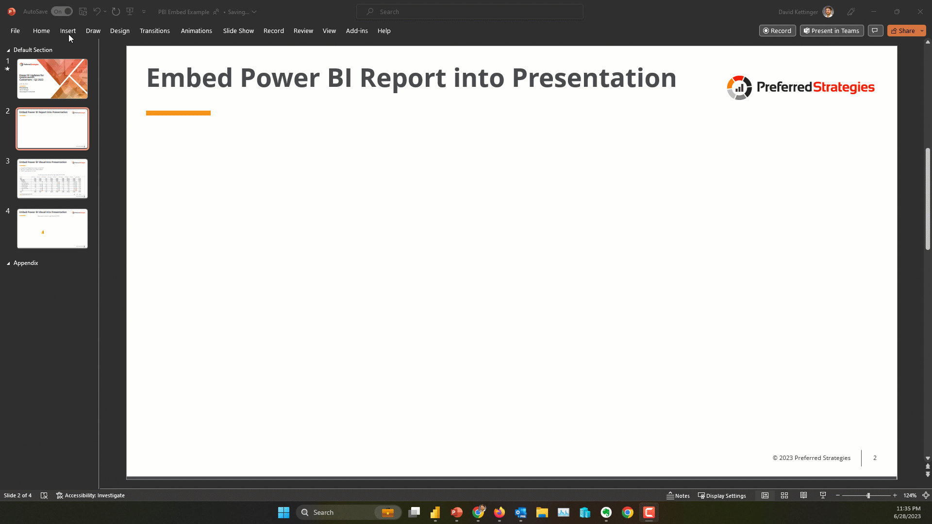
Enhanced Integration Between Power BI and PowerPoint
In past iterations of this presentation/blog we showed you how you can embed Power BI reports into a presentation using the Power BI Add in for PowerPoint. Taking that a step further, you can now embed single visualizations that pertain to your slide. This allows people to easily make their presentations more interactive and informative. To do this simply click the Share option in the visual menu and then paste the provided link into the PBI Add in dialog box.

Power BI Designers
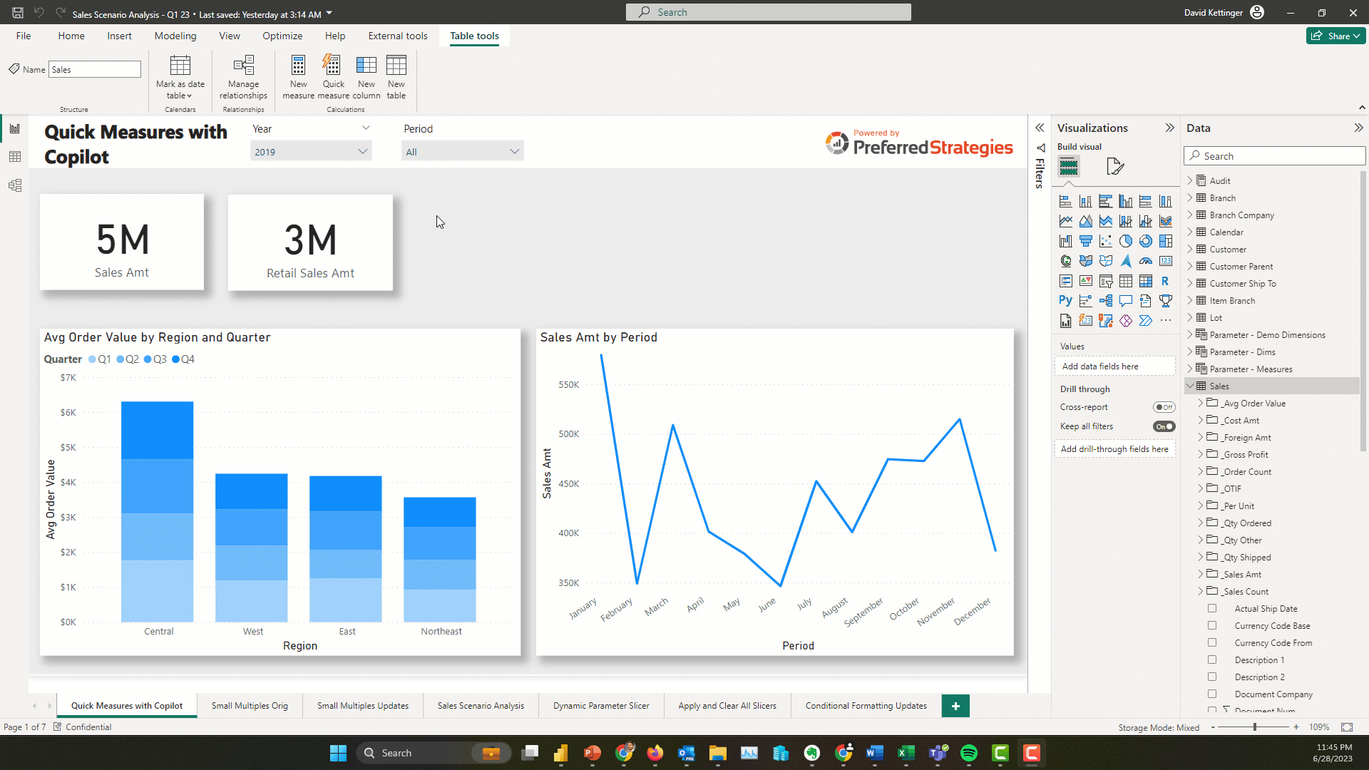
Quick Measure Suggestions (Preview Feature)
Building on the Quick Measures feature that was introduced a few years ago, the Power BI team has introduced natural language query technology into the fold to automatically generate DAX code suggestions to users. This accelerates the learning curve to get started with creating measures in Power BI and is a taste of what’s to come with Copilot generative AI features coming soon. This doesn’t mean that you don’t need to take some DAX classes or validate and test your measures in addition to having a formalized process for introducing these into your company’s centralized data model.
Enhanced Report Authoring with the Optimize Ribbon
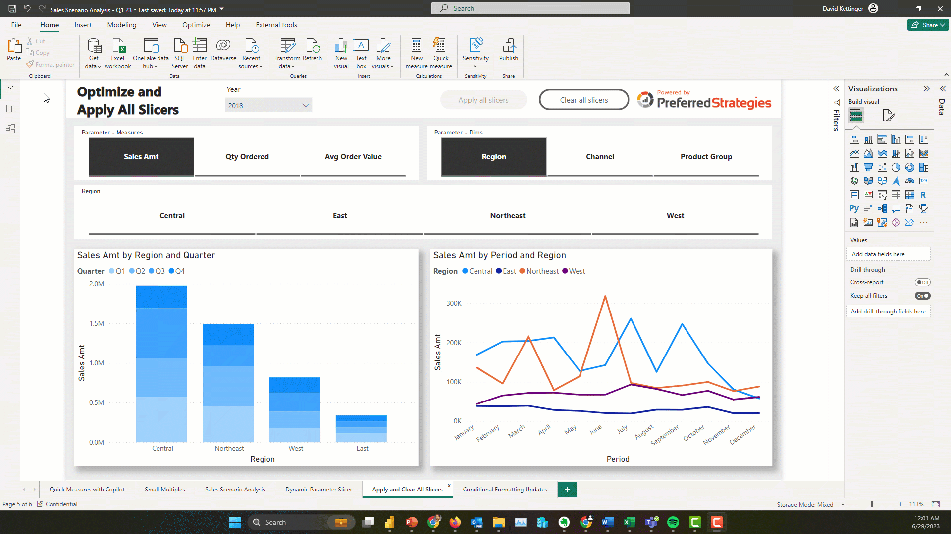
With the new Optimize ribbon, report creators can improve both the development process and the consumer process through three new features that were combined with the Performance Analyzer feature. The first is the Pause visuals button which stops Power BI from sending queries while you are making changes to your report. Next up are Optimization Presets. These allow you to apply different settings combinations for Query Reduction, maximum Interactivity, or a custom blend of settings that works best for your needs. Lastly, the new ribbon allows you to add an Apply All Slicers button to a report that will turn off the visual refresh while users are making slicer value selections. These features are particularly useful for users who are working with very large datasets or a Direct Query report and need to optimize the user experience or for scenarios where consumers request many slicers which can slow down report performance.
Improvements to the Small Multiple Visual
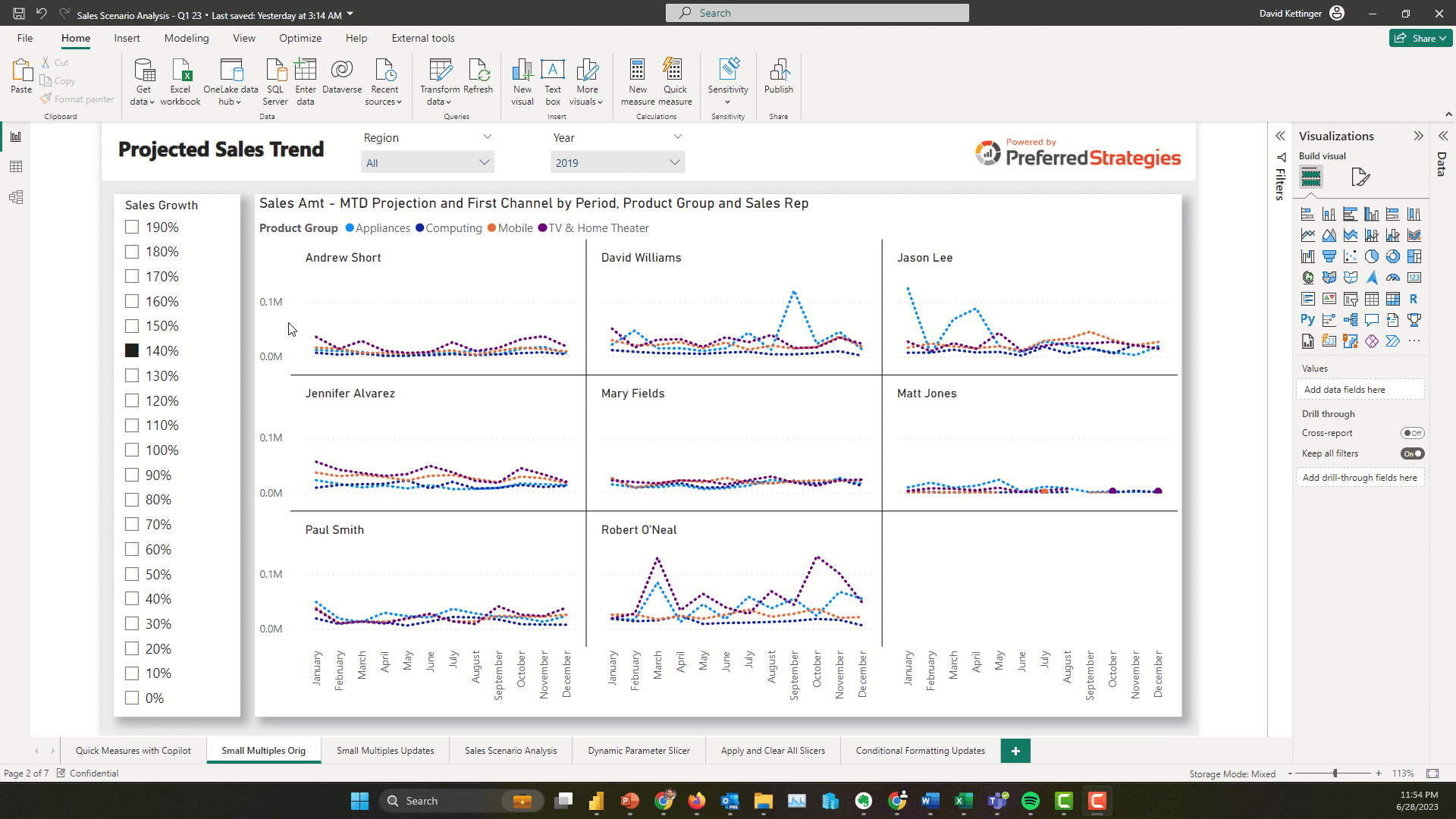
The Small Multiple Visual was a great addition to the visualization suite in Power BI but it had a few gaps when released including making it more legible as you scaled the number of multiples. Fortunately, this has been addressed with the ability to unsynchronized the axes and scale each chart individually. This is accomplished by unsharing the y-axes and enabling the scale to fit option.
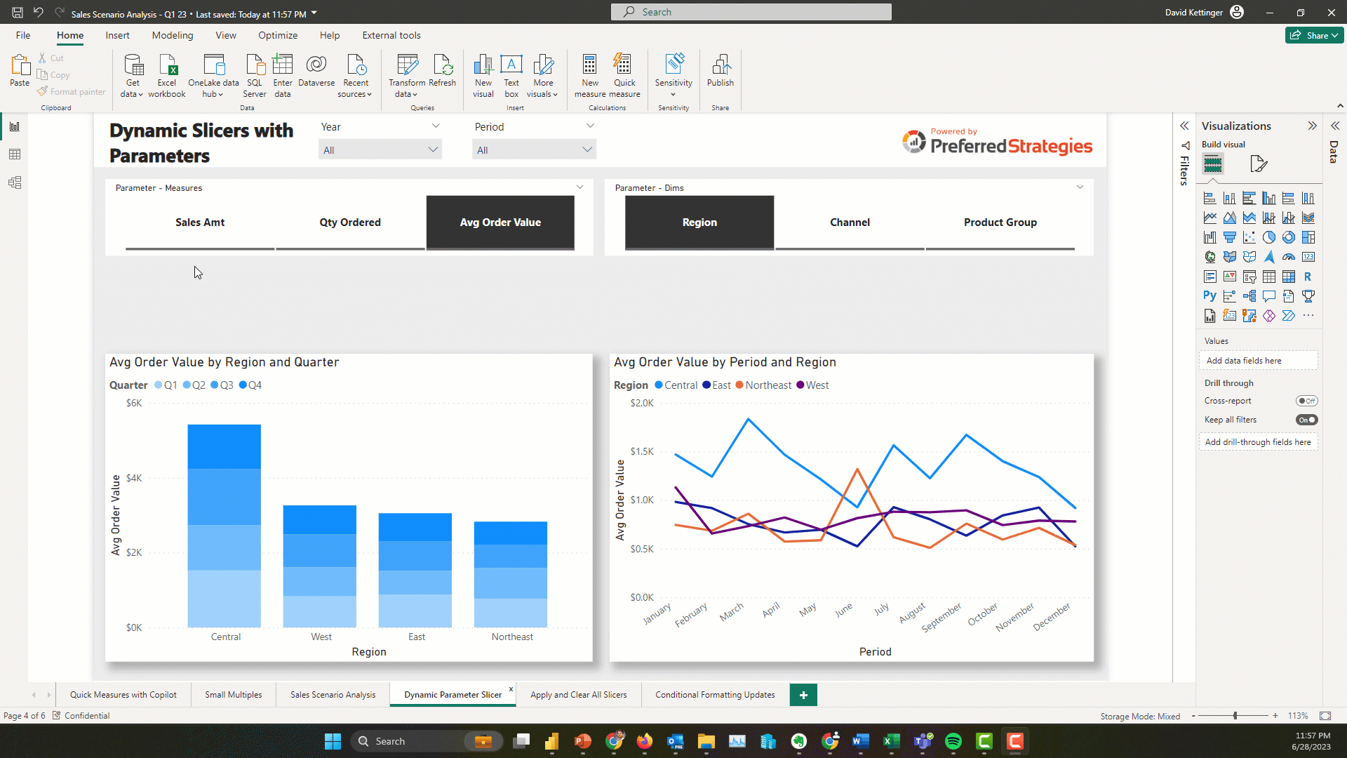
Create Dynamic Slicers with the New Field Parameter Feature
In the last iteration of this blog/presentation (link to blog), we demonstrated how you can use the Field Parameter feature in PBI to create dynamic visualizations and perform scenario analyses. With the latest update to this feature, you can now create dynamic slicers to allow users to slice by the values of the dimension parameter slicer. To do this you need to copy and paste the dimension parameter slicer and choose the option to show the values of the selected field in the field well.
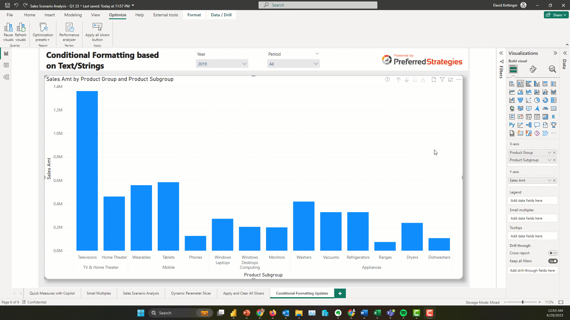
Conditionally Format Visual Elements based on Text/String Fields
This is an exciting update because in the past the standard options only included support for numeric based conditional formatting and in order to accomplish this you had to do some fancy footwork in DAX adding new fields that linked string values to color codes. Now you just have to choose the format by Rules option and select the string field you want to use and list the value in the rule dialog box.
Smart Narrative Feature Built in for Visual Summaries
Power BI introduced its Natural Language Generation feature, Smart Narratives, a couple years ago but up until now you had to create a dedicated visual on your canvas to house this written analysis. However with this update you can enable your consumers to get these ML generated features on demand for each visual on your page to expose new insights. To enable for your report, simply click on the visual and then enable the Smart Narrative icon in the Format pane.
Update to Page Navigator Visual
No more hiding and unhiding pages in your report! Now you can easily choose with pages to include or not include using the Pages section of the formatting pane. This feature is especially useful if you have a lot of pages in your report.
Enhance Your Visual Containers with New Subtitles, Dividers, Spacing and Padding Settings
In the last iteration of this blog/presentation (link to blog), we demonstrated how you can use the Field Parameter feature in PBI to create dynamic visualizations and perform scenario analyses. With the latest update to this feature, you can now create dynamic slicers to allow users to slice by the values of the dimension parameter slicer. To do this you need to copy and paste the dimension parameter slicer and choose the option to show the values of the selected field in the field well.

Power BI Admins & Content Managers
Paginated Reports Supported for Power BI Pro Workspaces
Before late last year, Paginated Reports were only supported in Premium workspaces but that restriction has been lifted and you can now publish these traditional operational style reports with a Pro license. In addition, there is a new migration tool as part of SQL Server 2022 that will help customers migrate SSRS reports to the Power BI Service which can help free up resources on your SQL server instances. These two updates should allow most companies to start using Paginated Reports alongside there interactive Power BI reports.
Allow Email Subscriptions to be Sent to External Users (Premium Feature)
If content is backed by either a Premium Capacity or Premium Per User license, users can set up subscriptions for external users that are not inside your company and haven’t been invited to your Azure AD B2B directory. You can control which users and security groups have access to this or to disable the feature in the tenant settings section of the Admin Portal.
Improved Way to Upload and Manage Power BI and Excel Files
There’s a new way to upload Power BI Excel files in Power BI and it’s much better. The UX has changed and now there is a drop down for Upload in the top of the workspace screen where you can choose to upload a file from Sharepoint or OneDrive for Business as well as Browsing your pc for a local file. The advantage of Sharepoint and OneDrive method is that your saved changes from PBI Desktop are saved automatically about every hour.
Intro to Fabric and Enabling the new Fabric Platform for Your Tenant (Preview Feature)
Fabric is the new end-to-end cloud analytics platform from Microsoft that includes a Data Factory-powered data integration experience, Synapse-powered data engineering, data warehouse, data science, and real-time analytics experiences and business intelligence (BI) with Power BI; all connected to one data lake (OneLake) and delivered as a SaaS solution. Stay tuned for the next iteration of this PBI updates series where we will peel back the different layers of Fabric and discuss their readiness for enterprise analytics as well as provide demonstrations over QuickLaunch data.
In the meantime, if you’re a PBI Admin, you can choose to turn on the Fabric platform preview for your tenant, by enabling the new corresponding tenant setting. If you don’t choose to opt out by July 1st, 2023, it will automatically be turned on. If you do opt out before then, it will stay off until you enable it.
For customers running Power BI Premium capacities through P SKUs, the new Fabric experiences will not affect your resource usage on your capacity before August 1st, 2023.
Starting in June, the Power BI Administrator Role will be renamed the Fabric Administrator to align with changing scope of new platform.
Starting in June, the Power BI Free license will be renamed to the Microsoft Fabric (Free) license.
Read more
(click to view larger)
That wraps up this installment of the Power BI updates blog. Join us for Part 2 of this presentation on July 20th by registering here. If you’re interested in checking out the Power BI feature release plan in an interactive Power BI report click here.