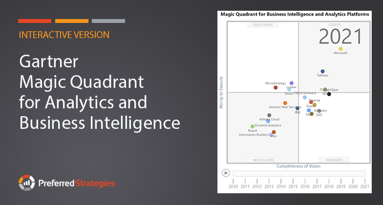
In this article we showcase an interactive version of the Gartner Magic Quadrant for Analytics and Business Intelligence (ABI) built using Microsoft’s Power BI platform. Using this interactive view of the data, you can see how vendors have trended over the past 11 years.
What is the Magic Quadrant?
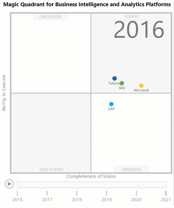
Every year, Gartner, an independent technology research firm, publishes a graphical representation of the ABI market in the form of a “Magic Quadrant” (MQ) report. The purpose of this analysis is to summarize a company’s ability to deliver their solution based on their current vision compared to market standards and other competing technologies.
Simply put, a quadrant is four areas made when a plane is divided by an X and Y axis. In this case, the X axis measures the Completeness of Vision or the company’s recent history of innovation and direction of their product. The Y axis measures the vendor’s Ability to Execute on their vision. Gartner uses a defined set of criteria across 12 critical capability areas to score where a company is positioned on each axis and a point is plotted at the intersection of these values to give the vendor’s position within the MQ.
The four sections or quadrants a vendor can fall into include:
1. Leaders
These companies have separated themselves from the competition by demonstrating their ability to execute today’s standards and have proven themselves with past success along with a clear product roadmap that includes the technological standards of the future.
2. Visionaries
Vendors in this category recognize the future direction of the data analytics market and have a vision for implementing these new standards but do not yet execute this vision well.
3. Challengers
This group of vendors are performing well by today’s standards but lack the vision of what the future of the data analytics market will demand or have no clear plan on how to get there.
4. Niche Players
These players usually specialize in a small sector of the overall data analytics marketplace and do not have a plan for expanding their vision. Or they do not specialize but lack the ability to out-innovate and outperform other competitors.
Where does Microsoft fit in?
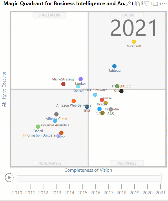
In 2016, Preferred Strategies, shifted from a primarily SAP focused firm to a Microsoft shop after noticing the momentum that Power BI and related SQL Server and Azure technologies had in the data analytics marketplace. At this time, the scene was really dominated by three vendors: Microsoft, Tableau, and Qlik. In the image below, you can see how Microsoft has separated themselves from the pack over the past 3 years to become the dominate leader in the data analytics space.
Microsoft has been in the Leaders quadrant for the past 14 years. During the past 5 years, their dominance has stemmed from the success of Power BI, which has been adopted by over 250,000 organizations including 97% of Fortune 500 companies. Microsoft attributes this success to three main points including:
1. Industry leading BI capabilities
Cutting edge visualization functionality with the familiarity of Microsoft Office tools. Microsoft is committed to infusing AI technologies throughout the entire platform to create a revolutionary augmented analytics experience.
2. Fully governed & trusted
Power BI is built on the mature and rapidly evolving Azure cloud infrastructure which has Microsoft Information Protection and Microsoft Cloud App security included.
3. Best economics
At $10 per user per month for Pro and with Power BI Pro included in Office E5 licenses, the cost of owning Power BI is between a quarter to a third of the price of other platforms. This means organizations can deliver insights to everyone without worrying about the bottom line.
Overview of PBI Report
The report below gives you the ability to track how the different vendors have performed over the past 11 years within the dynamic scatter chart with a play axis on the bottom. If you select a data point (or CTRL click multiple data points), you can see a traced trend path for the selected vendor(s). In addition, you can observe the variances for each axis value in the bar chart. You can narrow the report down to specific years and vendors using the slicers in the top of the page. Click on the help icon in the top of the report to see helpful information about using the report.
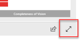
Note: Click the expanding arrows in the bottom right of the report, to view in Full Screen.
About the Dataset
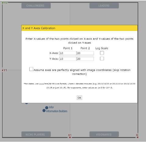
To create the dataset for the report, we took images of the past 11 years of Magic Quadrants and loaded them into a web tool called the Web Plot Digitizer. Once the image is in the web tool, we assigned numerical values to the axes. In this case we chose a scale of 0 – 20 but a different scale could be used such as 0 – 100. Although this is not necessarily the scale that Gartner uses, it still works great for our primary purpose which was to show a year over year trend of the different vendor positions.
Step 1: Load images in the web tool, calibrate the axes, and set the scale.
Step 2: Plot a coordinate on the digitized quadrant in the middle of each vendor data point.
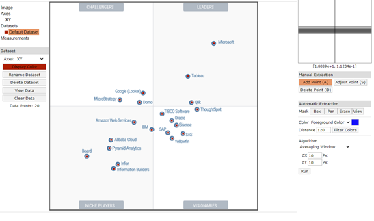
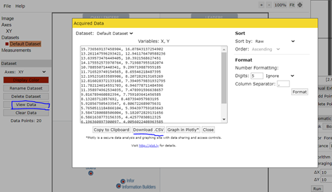
Step 3: Export coordinates data to CSV file and then create a column for vendor and year. Load data into Power BI.
Getting started with these tools and Preferred Strategies
If you are interested in getting started with Power BI, you can download Power BI Desktop for free and begin creating reports like this today. At Preferred Strategies, we specialize in helping organizations connect their Enterprise Resource Planning systems and other common data sources to Power BI. With our QuickLaunch solutions, you can quickly get up and running analyzing your corporate data in a matter of weeks.