Interactive Data Visualization Guide for Power BI
Choosing the right data visualization can seem like an intimidating task to some people especially if you have been limited to data tables in Excel for the past 20 years. The Interactive Visuals Guide is meant to serve as a reference for you when deciding on what chart types to use for your analysis. We hope that you will use this to find the right chart for your reports and dashboards and break away from the rows and columns.
|
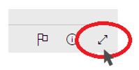
Expand the report full screen seen here. |
 |
|

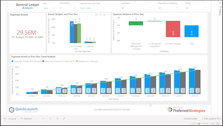
If you need help navigating this Power BI report for drill-down and filter analysis, download the Preferred Strategies Power BI navigation guide here.
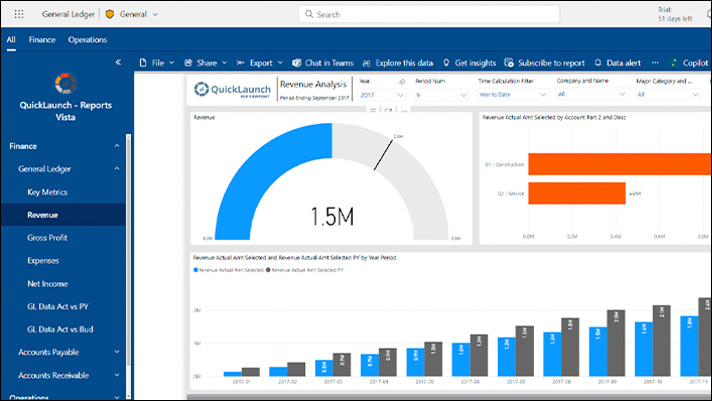
This report was produced using Microsoft Power BI. If you are interested in taking a deeper dive into Power BI and QuickLaunch for JD Edwards, sign up for a Free Trial where Preferred Strategies will setup a trial account for you so you can create your own beautiful reports and dashboards in a Power BI JD Edwards sandbox environment. Select the button above to sign up and Preferred Strategies will create your account and direct you on how to get started.